Sunday 24 February 2013

50 THINGS TO DO BEFORE YOU'RE 11 3/4 - TASK


https://www.50things.org.uk/

'50 Things To Do Before You're 11 3/4' is a National Trust initiative to encourage children to explore in the countryside and experience the activities that their parents and grandparents would have when they were younger. The list includes learning how to skim stones, making a grass trumpet and climbing hills.

The task was to create a spread from an accompanying book to encourage children to engage with the activities, and could contain additional elements. The considerations were as follows:

  • Quantity and size of type, and typeface used
  • Visual balance between the image and the text
  • Appropriate illustration style
  • Flow and continuity of the design from one double page spread to the next
  • Integration of type
Due to my illustration style and following on from the session's research I already knew which direction I wanted to take with my spread, and especially the typography. The work of Simms Taback and Vladimir Radunsky had encouraged me to be very expressive with type.


The first sketched idea shows the approach I was aiming for, with a childlike, cursive type style and overly simplistic illustrations with just charcoal on paper. I highlighted the word 'really' within the text to give the type some character and added 'get muddy' in parentheses to add humour and appeal to the child reading. I planned to add a simple, pale green and brown wash to the background.


These images show the development towards a more finalised illustration, and although I liked the style of the typography I felt that the composition wouldn't work together. I had planned to construct it all separately and  bring the elements together on Photoshop but they wouldn't blend together well.

I scrapped that page idea but kept with the same style, and focused my attention on illustrating the page for 'Climb a tree' instead.


Again, I used a childlike style for the text, and added the word 'tall', and embellished it. I chose thin and long strokes and rendered them like tree branches to bring the text in line with image.


This is the final spread that I designed, to meet the considerations stipulated:
  • In terms of type, I was to look into the typeface used, and the quantity and size of it, as well as integrating it into the image. I feel that type and image is as one in this spread, and they both clearly follow the same style. I kept the text to a minimum, just adding one word, and set it large within the page.
  • I had to choose an appropriate illustrative style and feel that a simplistic design like this is appropriate for any age group that it is aimed at. The paint seems naive, not always staying within the lines, and a limited palette was used. I added another element of interest, with the owl looking up at the child climbing the tree.
  • The design should have been able to be continued throughout the book, and I feel that the layout of type on one side and illustration on the other definitely could be. The style of the text could also be changed throughout, to suit the location of the other activities.

Thursday 21 February 2013

TYPE IN CHILDREN'S BOOKS

Typography is an important consideration within children's book design, and a type style needs to be chosen that will compliment the illustration but not compete with or detract from it. The legibility of the type can differ in importance through age genres, and whether the child will be reading or read to.

In the 1800s and early 1900s when children's books first appeared, the type styles were similar to those in adult's books, with black serif type separate to the illustration and on a white or pale background.

Edward Lear - Alice Through the Looking Glass
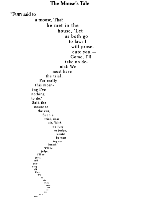
Edward Lear's poem 'The Mouse's Tale' in his 1871 book takes the form of a concrete poem, where the text is formatted to the shape of a mouse's tail. This would all have been done my hand and would have been  a very time-consuming and fiddly operation.

The Scarecrow - Theo van Doesburg and Kurt Schwitters
The Scarecrow was published in 1925, and featured illustrations made up almost entirely of typographic characters and broke the conventions of text colours and orientation, with some type set diagonally. They were influenced by the art styles of Dadaism and challenged the boundaries of design. Although this was a ground-breaking attempt to shake up the environment of children's book design I do not feel it has really stood the test of time, and at the present day would probably only appeal to art students and design enthusiasts, and children would not be interested.

This is the House that Jack Built - Simms Taback
Simms Taback was an American author and illustrator who made great use of type, in books such as 'There Was An Old Woman Who Swallowed a Fly' in 1998 and 'This is the House that Jack Built' in 2002. The text is very much a part of the illustration, and is always created playfully.

The Serif Fairy - John Siegfried
'The Serif Fairy' features characters and illustrations made up of different typefaces. I feel this is a modern reworking of 'The Scarecrow' and again is an experimental piece that wouldn't appeal to children due to the static nature of the illustrations and the fact that they would be difficult for a child to relate to. This book would again find its audience in design students and enthusiasts.

The Stinky Cheese Man - Jon Scieszka, Lane Smith and  Molly Leach
'The Stinky Cheese Man and Other Fairly Stupid Tales' is a collaborative work between author Jon Scieszka, illustrator Lane Smith and designer Molly Leach. The type interacts with the illustrations, which is shown on this page where the type is warped by the smell of the Stinky Cheese Man. I don't like the main illustration on this spread, but I do like the smaller vignette within the text and the way the text has bent around the image.

An Edward Lear Alphabet - Vladimir Radunsky
The type used in Vladimir Radunsky's 'Edward Lear Alphabet' is very expressive, and uses a lot of different styles. I love the scrawled hand drawn type used for the title, which has a very naive and childlike quality.

Type Considerations

  • What is the age of the target audience?
  • How much text needs to be included?
  • Does it match the mood, tone and style of the book?
  • Is the book to be read by the child, or read to the child?
  • What is the book's genre?
Children's Type


These types designed specifically for children's literature tend to include:
  • handwriting style a's and g's
  • extended ascenders and descenders
  • rounded and open counters
  • medium weight
  • mix of upper and lower case
  • large x-heights
These features help the type appeal to children and make it suitable for their learning needs. Research has shown that round things are easier to ascribe values to, and so feel warmer and more friendly than older serif fonts. This form of typography can affect a child's willingness to read, encouraging for younger children but older children may feel that it is too young for them.

LYNNE CHAPMAN


Visual Style

  • Lynne Chapman uses pastels on pastel paper to create a vibrantly colourful illustration
  • She draws out the line work first, then traces over for the final image
Planning Processes
  • She creates small thumbnail sketches for each page
  • Her first sketches are rough and devoid of too much detail so that not too much is wasted if the work is scrapped
  • Initially her characters are sketched from photographs, especially animals, before they are reworked to find the essence of the characters


ED EMBERLEY


Visual Styles

  • Ed Emberley uses a wide variety of materials to create his work, including felt tip pens, digital software, childlike thumbprints, fineliners, watercolour brushes and even wood cutting.
  • Much of his work features bold colours, with minimal detailing
  • He began as a cartoonist, using old style materials
  • Recently he has begun to branch out into interactive stories for tablets
  • He deliberately changes his style regularly in order to appeal to a wide range of people.
Planning Processes
  • Keeps separate line sketches and swatches of colour from old pieces of work in order to reuse them


Tuesday 19 February 2013

ART STYLES - 3-6 YEARS

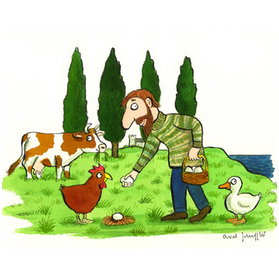
Books for this age group tend to be very creative and the illustrator has a lot of freedom, as the pictures tend to lead these stories. While the writer's job sounds quite difficult as they have to ensure the story is engaging for the age group but also limit their writing to short words, the illustrator can exhibit a lot more freedom. An illustrator that I enjoy for this age range is Axel Scheffler, whose pictures have a very noticeable style with large white eyes with black pupils and long noses. He has worked on some very popular children's books, especially with his collaborations with Julia Donaldson, and his illustrations are like a mark of quality for the book.


This style uses humour, and although all the eyes look the same I find that their placement and the placement of the pupil within the eye gives the characters their own personalities. This is a very important aspect of illustration in my opinion, and one that this particular art style excels at.

ART STYLES - BABY FIRST OBJECTS BOOK


The BBC4 documentary spoke about Helen Oxenbury's books for babies, and especially this one called 'Friends' that introduces the notion of friendship and companionship for very young babies. Like most books for babies, the illustrations are printed on board instead of paper, with smooth corners, to keep both baby and the book safe. This book doesn't need text, and just shows happy characters interacting. Features are kept to a minimum to encourage recognition, for example the baby's face contains just two dots for eyes and lines for the nose and mouth, and the colours are muted and distinct. Many books for babies are more tactile, and allow interaction.


Again, very simplistic illustrations are used, though I don't find these as appealing as those within Helen Oxenbury's 'Friends'. Many different textures are used, such as the fur patch on the bear's ear, which enables the baby to join in and learn through touch. I feel this is the most suitable art style for baby books as it adds another element of learning and fun.

ART STYLES - INFORMATION/REFERENCE TITLE

Children's reference books often use realism in their illustrations, and combine these with photography. Dorling Kindersley are famed for their children's encyclopaedias and atlases and use this mix of styles within their work to remain informative and interesting, and it is often necessary that these images are accurate and to scale.


This is shown in the above images. The spread with the beetle comparison seems to be mainly photographic, with all the insects scaled to the same degree to easily show size differences, and the pages about the children also mainly use photography, though there seems to be a few small illustrations on the page as well. This one seems quite dated due to the style of photography and page layout, and wouldn't have inspired me as a child, but there is a lot of information to convey there. The illustration of the squid is very realistic, which may be needed in the context of the encyclopaedia.

The Horrible Histories series made great use of illustrations within the books, which matched the tongue-in-cheek, humorous and occasionally gruesome text. Three illustrators were used for the series; Martin Brown, Mike Phillips and Philip Reeve, but a consistent style meant that the changes weren't noticeable across the titles.


These use a much more informal approach, with mainly line drawings within the books and a colourfully rendered and often embossed cover. The internal illustrations often resembled newspaper editorial cartoons, and used puns and humour which appealed to me when I read the books. I think this style of fun illustration can have a greater effect than realism, although sometimes that is required within the context of the book.

Wednesday 13 February 2013

BBC4 - PICTURE BOOK: 'WHEN WE WERE VERY YOUNG'

This programme guides us through a history of children's picture books, using notable examples to demonstrate the changes in attitudes towards children's literature and learning over time.

The first children's picture books were based on popular nursery rhymes, which despite being often nonsensical had been passed down generations. These were told as a bonding experience between the parent and the child, using sounds and movements and rhythm more than the words themselves to tell the tale. These picture books began in the late 19th century with illustrators such as ARTHUR RACKHAM, known for illustrating Alice in Wonderland amongst others, and RANDOLPH CALDECOTT, shown below. He is renowned for the details and humour within his illustrations, with events happening in the background to help move the story forwards, instead of merely drawing what the words are telling us.


BEATRIX POTTER
In the early 1900s Beatrix Potter broke the mould as a young woman writing and illustrating and creating a timeless series of children's books, which didn't shy away from scary themes, such as Peter Rabbit's father being made into a pie. Beatrix Potter loved animals and would draw them for hours, and by personifying animals for the main characters, she bypassed issues of class, gender and race. Her observations of animals and studying their skeletons gave her great understanding of their structures and personalities, which led to very accurate illustrations, despite the fact that they were often clothed.

REV. WILBERT AWDRY
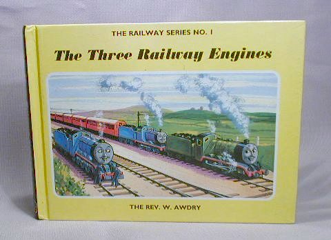
In the 1940s, railway enthusiast Rev. Wilbert Awdry wrote down the stories he told his son about the adventures of a group of steam trains at a station. This was a marked difference to the usual stories about children or animals, though the trains were personified by giving them a human face at the front which showed the emotions that they were feeling. Due to his religious background, his stories always had morals and are often thinly disguised parables.


ENID BLYTON
The popular novelist Enid Blyton was approached to write a series of children's books in 1949, and created the Noddy series after meeting the illustrator Harmsen van der Beek. The use of colour was a major part of the books, with colour used on every page. The magic of the series was the fact that it brought toys to life, every child's fantasy, and something that Pixar tapped into decades later with Toy Story. However, the books weren't universally popular, with modern liberal parents disagreeing with Blyton's seemingly puritan values, and the presence of violence and strict authority figures. The presence of the golliwog toys was also controversial.


BRIAN WILDSMITH
Brian Wildsmith is an artist and illustrator who was commissioned by Mabel George of Oxford University Press to create a different 'ABC' book. To Wildsmith, A was not for apple, A was for A. His work was commended for its use of colour and texture and exuberant paint.


PAT HUTCHINS
Pat Hutchins wrote Rosie's Walk, a tale about a hen. After her original manuscript was rejected, she focused on one line she'd written about how quiet the fox was, and illustrated a story like a silent film. The simple text follows the story of Rosie walking around the farm, and ignores the chaos happening around her as a fox tracks her every move and keeps getting into scrapes. This allows children to tell their own stories about what they see.


SHIRLEY HUGHES
Shirley Hughes wrote 'Dogger' as she was inspired by an incident in her family and was driven to write a story about real children and real problems. She studied children and refined her skills with life drawing, allowing her to accurately portray a child's emotions. Again, she drew beyond the narrative, and her audience learns to read and look into the scene. The book pulls no punches as a child's beloved stuffed dog is lost, found, lost and then found again.


JOHN BURNINGHAM
John Burningham's Granpa deals with everyday life between a grandpa and granddaughter, told via snippets of their conversation. This leads to quite a poetic storytelling effect, and leaves a lot for the reader to decipher and solve for themselves. It deals with serious issues but again allows the reader to finish the story, as on the last page Granpa has disappeared from his chair.


HELEN OXENBURY
Helen Oxenbury created a range of baby's books, using very simply shaped characters, with recognisable images that a baby can relate to. The books are wordless and 'Friends' features very simple expressions on the faces of the characters and shows how happy they all are with their friendship.


MICHAEL ROSEN/HELEN OXENBURY
'We're Going on a Bear Hunt' was adapted from an American folk song by Michael Rosen, which made great use of onomatopoeia and repetition. The recapping at the end of the story when the bear chases the family back from the caves enables the young reader to recognise the scenes that they pass through again.


CHILDREN'S BOOK GENRES - 9-11 YEARS OLD

ROALD DAHL


Roald Dahl's books are incredibly popular with children of all ages, and remain interesting, fun and stimulating for many age groups. Humour is a major element in his work, often dark and gruesome, and he enjoyed scaring children. His work is often told from the point of view of a child, with nasty adults as the adversary and a good adult on the side of the child - for example Matilda, where the title character is the protagonist and comes up against the adults in her life such as her parents and the headteacher Miss Trunchbull, with just Miss Honey on her side. I believe these books fit into this age category or maybe a few years younger, as they are best read by the child.

Quentin Blake's illustrations have become synonymous with Dahl's stories, and neither looks right without the other. The book covers above show Blake's hurried style which is able to convey a range of emotions, and illustrations are also used within the books as small pen-and-ink vignettes, though the pages are mainly textual.

HARRY POTTER AND THE PHILOSOPHER'S STONE


Harry Potter is possibly now the most famous children's book franchise, and remains popular with the 9-11 year old age group. I think I was nine or ten when I read the first book, but children and adults of all ages love the stories. The design inside is laid out like an adult novel, but the covers can be quite expressive of the magical themes within, featuring images like stars and the lightning bolt scar. However, I feel in this case the design of the books is not as important as the title, which is what children would really look out for.


CHILDREN'S BOOK GENRES - 3-6 YEARS OLD

THE CAT IN THE HAT


Dr. Seuss books are great for children who are in the process of learning to read for themselves. The illustrations and stories are equally surreal, and the red and white stripes are iconic for the Cat in the Hat, even fifty years after it was first published. Although the stories can be quite long and wacky, Dr. Seuss limited his vocabulary in a way that younger children could enjoy the stories just as much. For 'The Cat in the Hat', a friend of Dr. Seuss gave him a list of 348 words that every six-year-old should know and he responded with this book, which uses just 236 distinct words.


The colour palette is very distinctive to this story, using just white, blue and red. The illustrations are quite detailed in places, and colour is used to pick out those main areas, and are very humorous. The typography used is more 'advanced' in style than that used in baby and toddler books, utilising a standard black serif type on a white background.

THE VERY HUNGRY CATERPILLAR


Eric Carle's 'The Very Hungry Caterpillar' transcends the age genres of children's literature, from babies to toddlers to first readers. The illustrations are beautifully made, and are always interesting, and the story again uses repetition to interest children and give the story rhythm.


This story also uses holes in the structure of the page in the style of books aimed for very young children, giving it a tactile edge. The text is understated and doesn't intrude on the illustrations, so that toddlers can just look and touch, but is clear enough for first readers. Again, the background is blank, so that the type is highly visible, and doesn't make the colourful paintings overbearing.

WE'RE GOING ON A BEAR HUNT


This book uses a very traditional illustrative style, in contrast to the others above, with more realistically rendered characters in pen and ink with a watercolour wash. The text on the cover is coloured like the paintings, though the text itself is uninspiring. Although this book was a favourite of mine when I was younger, if I came across this cover without knowing the story I don't think I would be drawn in.


Again, repetition in the text is a theme that follows through the story, with a problem found and overcome on each page. Here the illustrations are in black and white and possibly with charcoal, though I'm not sure if this is the original or if it has been digitally edited.


The illustrator changes the layouts of the pages, and here it resembles more of a comic strip as the action speeds up towards the end of the book where the tale reverses and the characters don't have time to think through their decisions. The onomatopoeic words and phrases such as squelch squerch and swishy swashy are also more interesting for children, especially when emphasised by the reader.

CHILDREN'S BOOK GENRES - BABY AND TODDLERS


This is typical of the style of a book aimed at babies, which helps to develop senses and encourages the child to explore with their hands. The colours are varied and patterns are used, though they remain pale and pastel toned to stay approachable and friendly. The illustration of the lion is very simplistic, with the main features of the eyes, nose and mouth clearly visible by the use of striking black against the light background.


Here is an inside page of this - or a similar - book, showing a typical spread. This page on the colour red uses different shades of the colour to increase familiarity, with just simple words like red, cat and fluffy bird. Again, the illustrations are overly simplified to be easily recognisable, with only the essential details remaining. The baby is able to interact with the illustration across the page where the wing of the bird is given a texture. The type used is typical with this age group, making use of rounded and inoffensive sans-serif fonts which replicate young children's writing.


This book seems to be aimed at a slightly older age group, shown by the more detailed illustration on the cover, though colour and pattern are still the main focal point. I think this is still aimed at toddlers, who would enjoy the repetition of the story and the comical illustrations to accompany it. This and the baby book both have rounded corners on chunky pages, so that babies and toddlers can hold and play safely with it without damaging the pages.


Inside, the designer has played with the structure of the book, where an increasingly wide circle shows the range of animals that the old woman swallows. The font used is similar and the repetition keeps the book fun for toddlers.

Monday 11 February 2013

CHILDREN'S ILLUSTRATORS INITIAL RESEARCH - NICK BUTTERWORTH

NICK BUTTERWORTH
Nick Butterworth is an acclaimed author and illustrator, best known for creating the 'Percy the Park Keeper' series of books, featuring Percy and his woodland animal friends, which was adapted for television with an animated series. He has also worked as a presenter, cartoonist and graphic designer.

I chose Nick Butterworth to focus on because I loved his work when I was younger, especially 'Percy the Park Keeper', and a book called 'Thud'. His other popular titles include 'Q Pootle 5' and 'The Whisperer'.
The characters all look happy and friendly, with a lot of light shades used and a pale palette. Watercolour is used in the 'Percy the Park Keeper' series, with the details in the foreground inked in with thin lines and the background untouched, creating a soft, blended look. The animals are personified, shown below where the badger and the fox can be seen leaning on the brick wall.
His work would appeal mainly to very young children I think, having the stories read to them by their parents, as the soft and friendly watercolour illustrations would definitely appeal. The images always have great composition, possibly owing to Butterworth's design background, and there is always plenty to look at within the illustrations.

CHILDREN'S ILLUSTRATORS INITIAL RESEARCH - AXEL SCHEFFLER

AXEL SCHEFFLER
Axel Scheffler is a German illustrator based in London, who has illustrated many popular children's books, most famously for Julia Donaldson's 'The Gruffalo'. His characters often carry the same facial traits, which he is able to adapt for animals and humans alike, often with large white eyes with small pupils and long snouts. He uses a lot of colour but often pale, pastel shades, creating a scene that is easy on the eyes.