Typography is an important consideration within children's book design, and a type style needs to be chosen that will compliment the illustration but not compete with or detract from it. The legibility of the type can differ in importance through age genres, and whether the child will be reading or read to.
In the 1800s and early 1900s when children's books first appeared, the type styles were similar to those in adult's books, with black serif type separate to the illustration and on a white or pale background.
 |
| Edward Lear - Alice Through the Looking Glass |
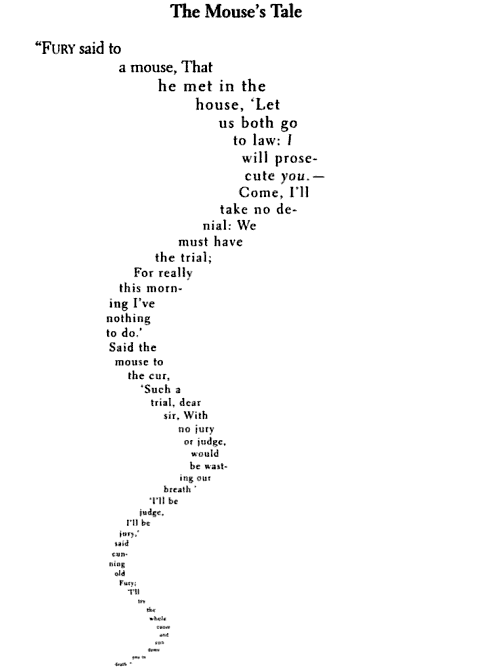
Edward Lear's poem 'The Mouse's Tale' in his 1871 book takes the form of a concrete poem, where the text is formatted to the shape of a mouse's tail. This would all have been done my hand and would have been a very time-consuming and fiddly operation.
 |
The Scarecrow - Theo van Doesburg and Kurt Schwitters
|
The Scarecrow was published in 1925, and featured illustrations made up almost entirely of typographic characters and broke the conventions of text colours and orientation, with some type set diagonally. They were influenced by the art styles of Dadaism and challenged the boundaries of design. Although this was a ground-breaking attempt to shake up the environment of children's book design I do not feel it has really stood the test of time, and at the present day would probably only appeal to art students and design enthusiasts, and children would not be interested.
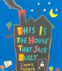 |
| This is the House that Jack Built - Simms Taback |
Simms Taback was an American author and illustrator who made great use of type, in books such as 'There Was An Old Woman Who Swallowed a Fly' in 1998 and 'This is the House that Jack Built' in 2002. The text is very much a part of the illustration, and is always created playfully.
 |
| The Serif Fairy - John Siegfried |
'The Serif Fairy' features characters and illustrations made up of different typefaces. I feel this is a modern reworking of 'The Scarecrow' and again is an experimental piece that wouldn't appeal to children due to the static nature of the illustrations and the fact that they would be difficult for a child to relate to. This book would again find its audience in design students and enthusiasts.
 |
| The Stinky Cheese Man - Jon Scieszka, Lane Smith and Molly Leach |
'The Stinky Cheese Man and Other Fairly Stupid Tales' is a collaborative work between author Jon Scieszka, illustrator Lane Smith and designer Molly Leach. The type interacts with the illustrations, which is shown on this page where the type is warped by the smell of the Stinky Cheese Man. I don't like the main illustration on this spread, but I do like the smaller vignette within the text and the way the text has bent around the image.
 |
| An Edward Lear Alphabet - Vladimir Radunsky |
The type used in Vladimir Radunsky's 'Edward Lear Alphabet' is very expressive, and uses a lot of different styles. I love the scrawled hand drawn type used for the title, which has a very naive and childlike quality.
Type Considerations
- What is the age of the target audience?
- How much text needs to be included?
- Does it match the mood, tone and style of the book?
- Is the book to be read by the child, or read to the child?
- What is the book's genre?
Children's Type
These types designed specifically for children's literature tend to include:
- handwriting style a's and g's
- extended ascenders and descenders
- rounded and open counters
- medium weight
- mix of upper and lower case
- large x-heights
These features help the type appeal to children and make it suitable for their learning needs. Research has shown that round things are easier to ascribe values to, and so feel warmer and more friendly than older serif fonts. This form of typography can affect a child's willingness to read, encouraging for younger children but older children may feel that it is too young for them.


No comments:
Post a Comment