Tuesday 14 May 2013

MOUNTED DESIGNS


My designs are now mounted and ready for submission! I chose to mount them very simply on black board with no borders, and orientated portrait to make use of the available space. I added labels as a title on one board and with my name on both, and used hand-lettering again to reinforce the style and show the continuity. I feel that the designs are presented well, although I am less happy with the designs themselves.

From the moment I began looking into the 'around the world' story I drew out the landscape for Peru which led the rest of the book, as I was happy with how it looked and I received encouragement for the style. This presented problems with the rest of the designs as they had to follow suit, as did the method of colouring, and I never really settled on a design I felt 100% comfortable with. I am a little disappointed for this reason and wonder if I had chosen one of the other possible briefs if I would have found a solution that I liked more,  as this is an industry that I hope to work in. Overall though, this has been a good opportunity to go through the process of book design and develop a story and book that I wouldn't ordinarily have followed, and a good experience in expanding my style. Coupled with my choice of Independent Study, this has also led to a design passion of mine for hand-drawn lettering and illustration and something that I will definitely take into the future.

Monday 13 May 2013

FINAL DESIGNS

Here are the final designs for the children's book for Naturesbase.


The cover continues the background illustration from the introductory page for Peru which I think makes a nice backing. I struggled with the cover more so than the inside pages - my initial designs on a similar story I didn't like due to the inclusion of illustrations of children which I feel isn't a strong point of mine and the previous one used a worn map effect as background but it was thought that this would appeal to an older age group than I was aiming for.

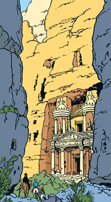
I am still not entirely happy with this design but I feel I have recreated the illustrative style of Herge's Tintin quite well. The title and back cover blurb are designed on a worn, aged paper style which is also continued within, and I have opted for hand-lettering. This use of hand-drawn type was the subject of my Independent Study and while initially I had wanted a change and to use Photoshop for the illustration with computer fonts, when encouraged to create the book by hand I decided on hand-drawn type. This suits the theme of this book, which I will expand upon when discussing the inside pages.


These pages would function as the start of the book. The left side introduces the book, encouraging the child to explore the world, and below this are instructions to create your own paper plane. In between the pages here is a tear out sheet with which to create the paper plane, and the right hand side says how to customise the plane and begins the tale in a humorous way. The pages use the same aged paper effect, which I hope gives the feel of an old explorer's map. The palette in the 'customise' section is created with colours found in the garden, something I was inspired to add after Gyles Morris' visit.


The explorer's map style is continued all the way through, here on the introductory page for Peru where describing briefly some of the features of that country. I kept the explanations brief and light to stay in keeping with the age group and focused on what I would have found interesting as a child. The use of hand-lettering within was designed to stay in keeping with the philosophy of the book, encouraging the reader to create things by hand and so I wanted to keep that obvious human touch prevalent in the book and not try to diminish that, rather celebrate it. This was a philosophy I took from extensive research into the subject in my Independent Study.

Although I have changed the story slightly from the notes from Gyles Morris. I hope I have done so in a way as to improve the book and its interactivity. I found the hot air balloon part of the story was too detached from the interactive side, and hand-made paper planes are in keeping with my idea here.

DESIGN UPDATE

At the peer assessment I was encouraged to introduce more of a hand-drawn edge to the illustrations, which I agree would add more character. I was enjoying using Photoshop for the illustrations as that is a new style for me, but completing my Independent Study on typography in picture books has given me a passion for hand-lettering and hand-created illustration. For these reasons I have remade the idea by hand.


I tried to recreate the image by hand as well as possible, while adding a rough and imperfect style to the lined  illustrations and finishing with a watercolour wash. This effect worked better than I thought it would and the uneven, mottled affect works well on the green areas and not too badly on the sky where it gives the impression of clouds.

In the top-left hand corner of the page I have recreated the banner on an old paper effect, titling the page 'Peru', while underneath is an old, worn, explorer's map showing more of the location. One of the pointers from the group session was that on the computer this style seemed to be aimed at an older age range than the genre of the picture book suggests but hand-drawn I think it is more suitable.

One major change to the story and the notes supplied by Gyles Morris is that it is no longer a balloon ride around the world but a paper plane instead. I feel this could add an interactive element to the book, where the child could play along and make their own paper plane which I will play around with earlier in the book.

The basic layout is the same and a similar style of worn paper will be used to explain the elements of the Peruvian country to continue the theme of exploration throughout. In the bottom corner is an introduction to the next pages of the book, which uses more colours than the explorers map style, where the reader can learn to make their own Peruvian headdress. I feel this would separate the activities from the information and make the book clearer to the child.


These designs are possibles for the new cover to follow with the different story. The title has to change, and I think it will be 'Paper Plane Explorer' which explains clearly the style of the book, but another option is 'Chocks Away' which is a famous aviation expression. I will continue the worn paper style here too but only as an addition to the main style as it may make the book look more grown up and appeal to the wrong age group.

The typography, and use of hand-lettering, will hopefully reinforce the idea that the story is for younger children as it tends to be used mostly in children's picture books for children around the age of 6.


This is a design for the other spread. Initially I was planning to illustrate the page following the layout for Peru, and show the reader how to create a headdress and make an Andean pattern. However, I think it would be more appropriate to design the first spread from the book, encouraging the reader to make a paper plane and introduce the story, while providing an extra sheet of paper to be used on the paper plane.

Thursday 2 May 2013

PEER ASSESSMENT

Cover design
Cover design
This week was the peer assessment for this module, and a chance to share ideas and explain your work to your peers and gain valuable feedback. The work that I presented is shown above, unfortunately unfinished pieces of work which isn't ideal, but due to the time it has taken to create them and time commitments with other projects this is where I am at with this task.

The feedback was generally positive, although the team seemed keen that I went with the same approach, just hand-drawn. I can see their point, and love to create work by hand, especially illustration, and so I think I will try again by hand. I will keep the same linear style however, and keep the Tintin books as an inspiration. I think that the group found that the computer aided style that I had utilised wasn't best suited to the age group and genre that I am aiming for, and instead thought it would appeal to older children. I definitely take this on board, and it was something I should have considered more, and I will need to look at how similar titles aim their information at a younger audience.

Tuesday 30 April 2013

DESIGN DEVELOPMENT

I was unsure about using watercolour for this design as I'm not sure that the uneven tone always suits the illustration, and I wanted to gain more experience with using Photoshop for illustration work. I recently found an illustrator called Chris Lee, thebeastisback.com, whose work I admire and he shared a video of his process on his Instagram account which inspired me to use this style myself.


www.vimeo.com/64215263

Having previously seen his work I was amazed at what he had done, but watching the video made me realise that I could attempt the same style as his work started as a line sketch, something that I feel that I can do well, and was added to layer on layer on Photoshop. 

He scans the sketch to Photoshop and drops the opacity before working on it with a selection of brushes in different layers. With his choice of brushes, he is able to give the work an old-style cartoon quality that I find reminds me of Hanna-Barbera. I set about working on the sketch that I had scanned in to see if this would be a viable means of designing for this brief.


Here is work ongoing on one spread. I was concerned that the image would look too computerised and the colours would appear too flat, but I was able to select brushes that gave the appearance of being created my hand and so it retains some of that quality. It also allows the image to be more editable due to layering, and as such I can move characters like the llama around until I am happy with their placement. While creating the background I realised that it was beginning to resemble a scene from Tintin by Herge.


I loved the Tintin comics when I was younger, and so I feel that the similarity to this style is not a bad thing as I feel that they are the ultimate in kids' adventure stories. This is the style that I will be persevering with throughout the project as I feel it has given me an opportunity to try something new and I am excited to see how it will end up looking.


This is a new design for the front cover, giving it more of an adventure edge than a picture book style, which I think would be more exciting for the target age group. The background of the image would resemble that of an old map with an aged paper effect and an old compass. I am not sure whether to use hand-drawn typography which I enjoy doing or a more vintage and traditional type style. The balloon will be brightly coloured, and a blurb on the back cover will be set on a paler box.

Thursday 25 April 2013

PROTOTYPES

I decided when creating the first prototypes to stick quite closely to the final submission criteria of a cover and two inside spreads, in order to provide a good realisation of the finished work. This has also shaped how I will be creating the book as I have decided that each country will have a spread showing information about it, and a spread with activities. For now I am carrying on with the designs for Peru, as it is a country I am interested in and so I feel that I should be able to convey more interest and enthusiasm this way. I began with the front cover.


I painted this in watercolour and then lined it with ink, but I am unsure about it. I like the balloon itself, and especially the typography. However, I do not like drawing people and I feel that they detract from the illustration, and the kite and journey stick do not add much either. I'm also unsure whether I like the effect of the sky and so the cover will need a lot of work to be done. I'm currently toying with the idea of the balloon flying over an old looking map which I think could be a nice effect. The title as it stands is 'Up, Up & Away' which I think will remain at this prototype stage as I haven't thought of anything more appropriate but again that is subject to change.


This is the informative atlas-style page which I am very happy with at the moment although there are areas that I am looking to improve. I think that this landscape style allows me to include a lot of features in a small space, and the explanation boxes could be fold out to provide more room. I like the balloon in the background which would provide continuity, and the style of this page could easily be adapted for other countries. As I said in the last post, I am unsure of how to apply colour, whether to try Photoshop or stick to watercolours, but I scanned this page so I can work on it in both ways and decide which style is the most appropriate.


I love drawing animals and so I had a little think of some of the most famous animals from these countries to include, and whether they could be used as guides in the activity pages.


This is a page where the child is encouraged to paint a traditional Andean pattern. I thought it would be a nice touch to include a section challenging the reader to find paint in the garden, for instance mud for brown and grass for green. This is something that Gyles Morris had us do on his visit and I think it would work well within this book. It also encourages the reader to get outside and get the book messy which would be nice.


This page was specified by Gyles, instructing the reader on how to make a traditional Peruvian headdress, which I also think should be made using materials from the garden. This page needs a lot of work to remain interesting, and maybe it should have its own spread with the Andean patterns as a border. I think I will have to include infographics and research how to actually construct one, and this could also be a point in which to include an interactive web element. However, I want this book to persuade kids away from the computer screen so perhaps not. In the bottom corner is the llama guide, which I think would be a nice touch.

FURTHER RESEARCH

At this stage I felt that it was important to research further into the world of picture books and those with environmental concerns at heart. I want my book to combine a few genres in one, to provide the information of a reference title, activities that encourage children outdoors and get messy, and the art style of a picture book. As I want to work in the area of picture books after university, as an author/illustrator or a book designer, I felt it wise to play to my strengths and choose the picture book project, and gain experience along the way.

I feel that this will also help to structure the book, and fit in with the story about a balloon ride around the world. For each different country I could perhaps use two double page spreads, the first showing the landscape and some information about it, and the second include activities for the child, and between the specific country pages there could be picture book style illustrative segways.

ATLAS/REFERENCE BOOK
When I was younger, one of my favourite books was a pop-up atlas, which gave information about certain countries and their languages, clothing and food etc. and I would hope to recreate some elements of that for the final work. Here I will look at some examples of reference style atlases:

My Pop-Up World Atlas - Anita Ganeri and Stephen Waterhouse


I really like this style for a child's atlas, and the front cover is extremely enticing with a variety of bright colours and interesting textures by the illustrator Stephen Waterhouse, with further images here: http://www.stephenwaterhouse.com/portfolio/childrens-books/my-pop-up-world-atlas/

The interior pages show the brilliant use of space within the atlas, with pop-ups and pull tabs revealing the information, which is also useful for trivia and facts. Every page contains a large map of the continent, and so the addition of paper engineering allows more information to be included. I think these elements and particularly the 'lift-the-flap' sections would be very useful when it comes to my design.

Usborne Children's Picture Atlas - Linda Edwards


This book uses a similar style in terms of the volume of illustration which gives the child a lot of interesting characters and colours to look at, but this time using a flat image. The title explains that it is more pictorial than informative, and so the illustrations are given priority.

I like the art style in this one, with Linda Edwards (http://www.lindaedwards.co.uk/) using a more painterly style befitting that of a picture book. I like the way the illustrations take centre stage but I want my book to have some informative elements so that children can come back to it for reference.

DK Children's World Atlas


Dorling Kindersley reference titles are well respected and known to be accurate, and I recall using them for information when I was younger. Looking at the cover here, it doesn't seemed to be aimed at especially young children, but it was always engaging. Photography is used a lot within, as well as photo-realistic illustrations and diagrams, and so is not an art style that I will choose to recreate when I create my own.

This title also includes a CD-ROM for interactive content which obviously is quite outdated now, but additional web content could be a bonus element in the book. This could maybe be useful in the sections where the child has to make something.

Activity Books
For activity books, I still look at the examples I noted down here for inspiration. The DK Doodlepedia book is probably the best that I have seen, and I would have loved that book when I was younger and probably still would now. Allowing space for the child to contribute to the book is a good element to include, and I will definitely incorporate that in some form. I would also add elements from the '100 Things to Make and Do' book and 'This Book is Totally Rubbish' as I want the children to have activities for them to make outside of the book, as well as learning about environmental concerns and sustainability.

PICTURE BOOKS - ART STYLES
For my usual illustration work I use watercolours, but I feel that they can become quite washed out sometimes so I will look at other ways to do this. One style that I have thought of trying recently is line drawings finished on Photoshop, from which I have found a few interesting examples.

Steve Simpson http://stevesimpson.com/ and Christopher Lee http://www.thebeastisback.com/
Steve Simpson is an illustrator and designer who specialises in computer-aided illustrations, and Christopher Lee is an illustrator who creates prints often influenced by toys and pop culture.


Their styles have similarities to me, and both inspire me to use this method myself, as I sometimes get frustrated when adding colour to my work, as I feel that my line work and drawing is quite strong and there is maybe more control when rendering on Photoshop, and definitely more chances to get it right. I will begin with line drawings so that I can experiment with the colours at a later date, though I think that I could also get a good result with watercolour or acrylic paint within strong lines.