
www.vimeo.com/64215263
Having previously seen his work I was amazed at what he had done, but watching the video made me realise that I could attempt the same style as his work started as a line sketch, something that I feel that I can do well, and was added to layer on layer on Photoshop.
He scans the sketch to Photoshop and drops the opacity before working on it with a selection of brushes in different layers. With his choice of brushes, he is able to give the work an old-style cartoon quality that I find reminds me of Hanna-Barbera. I set about working on the sketch that I had scanned in to see if this would be a viable means of designing for this brief.

Here is work ongoing on one spread. I was concerned that the image would look too computerised and the colours would appear too flat, but I was able to select brushes that gave the appearance of being created my hand and so it retains some of that quality. It also allows the image to be more editable due to layering, and as such I can move characters like the llama around until I am happy with their placement. While creating the background I realised that it was beginning to resemble a scene from Tintin by Herge.
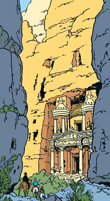
I loved the Tintin comics when I was younger, and so I feel that the similarity to this style is not a bad thing as I feel that they are the ultimate in kids' adventure stories. This is the style that I will be persevering with throughout the project as I feel it has given me an opportunity to try something new and I am excited to see how it will end up looking.

This is a new design for the front cover, giving it more of an adventure edge than a picture book style, which I think would be more exciting for the target age group. The background of the image would resemble that of an old map with an aged paper effect and an old compass. I am not sure whether to use hand-drawn typography which I enjoy doing or a more vintage and traditional type style. The balloon will be brightly coloured, and a blurb on the back cover will be set on a paler box.
No comments:
Post a Comment